Revamping a disjointed website for better UX

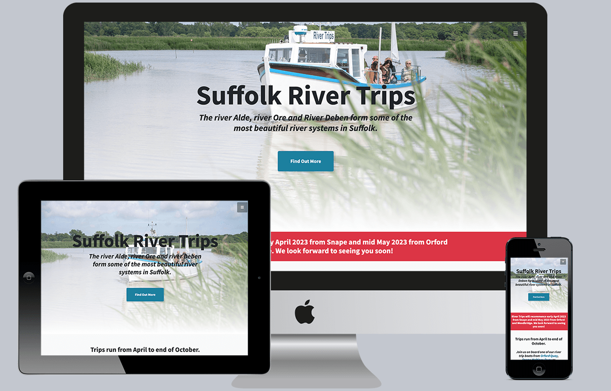
Suffolk River Trips needed me to add some content and bring the site up to scratch, which I did by fixing broken layouts and implementing identified accessibility issues. I also added analytics so that we could monitor the traffic that would allow us to make more informed decisions in the future. Part of the additions I made was to add the new logo to the site and implement some colours to go alongside it.

Their website had previously been built and maintained by a friend of theirs who could no longer continue in that role so they asked me to step in.

All in all, it looks great! The client was very pleased and kind enough to give me some feedback:

“J4G Design have been an excellent ‘one stop shop’ for our small business – Chris has helped us with all our marketing needs, most recently updating our website and providing valuable insights into website accessibility and designing a new DL leaflet. Chris has been great at prioritising work to fit our budget and we never feel pressurised into agreeing work until we are ready for it. We highly recommend J4G Design if you want friendly, efficient and effective help with your marketing needs.”

Client
See the live site
Year
No ACF gallery field data found

MORE WORK

Future-proofing the logo of a major US fencing supplier

Allstar Fencing US is a reseller in the States for a German brand (Allstar Fencing) and a global force in the sales of equipment for Olympic Fencing. Since starting the business, the logo of the original brand has changed but the Allstar Fencing US logo didn’t accommodate for an updated logo or have the word […]

Giving an identity to the Behavioural Experiments in Health network

The Behavioural Experiments in Health network is an organisational network for experimental and behavioural research in health economics, connected through Universities across the globe for policy, practice and management. They asked me to revive the BEH brand, which hadn't been used for a number of years. They wanted branding that could be used on the […]

Giving an identity to the Choice Research Centre

The Choice Research Centre exists as an organisation within the University of Leicester, who asked me to create an identity for them to use at events and for promotional materials. We focused on working towards a logo that put across the importance of making choices and that choices are not already straightforward with a clear […]

Artwork for the sports and fencing podcast: Fenced In

The Fenced In Podcast was created in the UK’s Corona virus lockdown to help fencers of all abilities, worldwide, continue their training without being able to go to fencing clubs. The hosts are two GB international foilists with nearly 30 years of experience between them, including: – Commonwealth Fencing championship medals in individual and team […]

Giving an identity to Consciously Tech

I created a logo for a platform that provides thought provoking content revolving around a holistic, responsible, ethical and sustainable approach to digital and information technology. It was important for the logo to capture this concept, for its audience as well as the number of experts being asked to be contributors.

Giving an identity to BEE-UK

I created a logo for BEE-UK at The London School of Economics - a network of Behavioural and Experimental Economists. We focused on working towards a logo that put across the importance of networking, as BEE-UK is a group of Economists from different Universities across the UK with a large importance on sharing work and […]