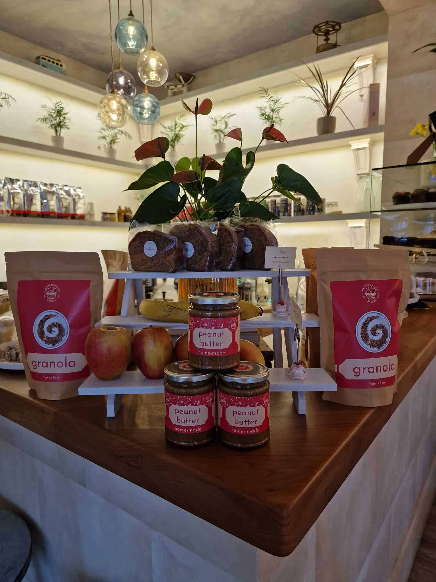
Increasing the sales of home-made food items through better packaging design

I designed new packaging and labels that helped double the number of sales in the café. This project started small and with a clear goal: to reduce the cost and time spend on packaging. The bakery used to sell bags of granola where the whole bag was a custom design but this wasn’t very cost effective – instead I was approached to take the existing design and transform it into two labels: one for the front and one for the back. This was a great success and the prototype labels and print runs that I did were very well received so much so that I was engaged again to design circular stickers for smaller take-away items and labels for a new product: jars of home-made peanut butter!

The client is thrilled with all of these and the individuality of the brand really stands out, making each product unique and easy to see from across the room while continuing to tie in with the brand.

Client
The Bread Basket Bakery
Year
2024

MORE WORK

Future-proofing the logo of a major US fencing supplier

Allstar Fencing US is a reseller in the States for a German brand (Allstar Fencing) and a global force in the sales of equipment for Olympic Fencing. Since starting the business, the logo of the original brand has changed but the Allstar Fencing US logo didn’t accommodate for an updated logo or have the word […]

Giving an identity to the Behavioural Experiments in Health network

The Behavioural Experiments in Health network is an organisational network for experimental and behavioural research in health economics, connected through Universities across the globe for policy, practice and management. They asked me to revive the BEH brand, which hadn't been used for a number of years. They wanted branding that could be used on the […]

Giving an identity to the Choice Research Centre

The Choice Research Centre exists as an organisation within the University of Leicester, who asked me to create an identity for them to use at events and for promotional materials. We focused on working towards a logo that put across the importance of making choices and that choices are not already straightforward with a clear […]

Artwork for the sports and fencing podcast: Fenced In

The Fenced In Podcast was created in the UK’s Corona virus lockdown to help fencers of all abilities, worldwide, continue their training without being able to go to fencing clubs. The hosts are two GB international foilists with nearly 30 years of experience between them, including: – Commonwealth Fencing championship medals in individual and team […]

Giving an identity to Consciously Tech

I created a logo for a platform that provides thought provoking content revolving around a holistic, responsible, ethical and sustainable approach to digital and information technology. It was important for the logo to capture this concept, for its audience as well as the number of experts being asked to be contributors.

Giving an identity to BEE-UK

I created a logo for BEE-UK at The London School of Economics - a network of Behavioural and Experimental Economists. We focused on working towards a logo that put across the importance of networking, as BEE-UK is a group of Economists from different Universities across the UK with a large importance on sharing work and […]