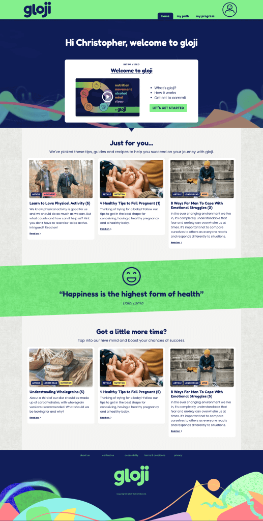
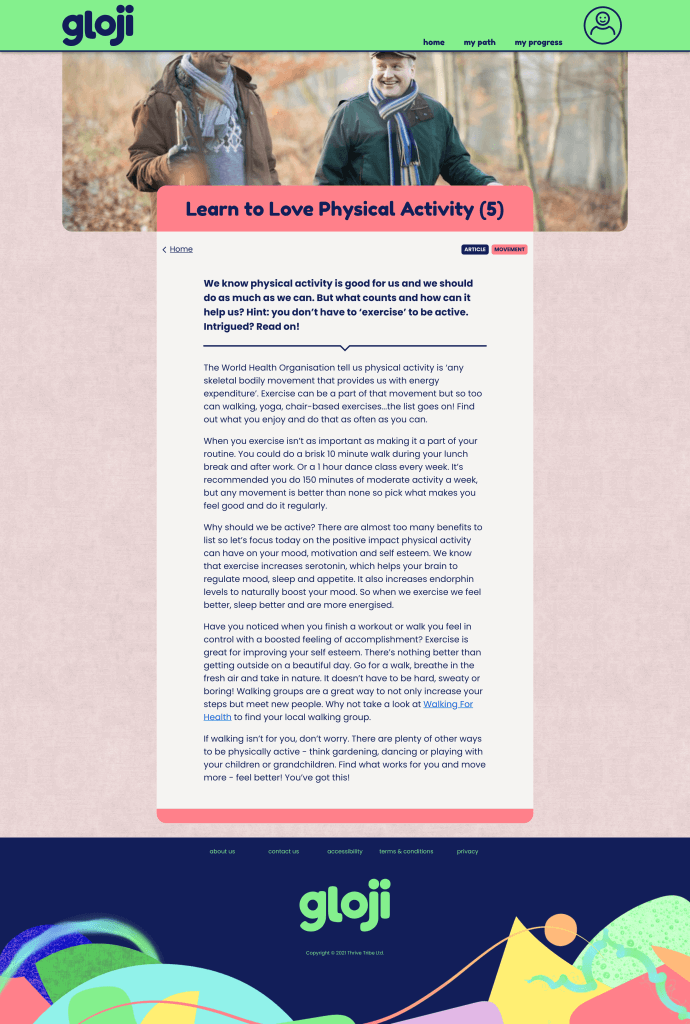
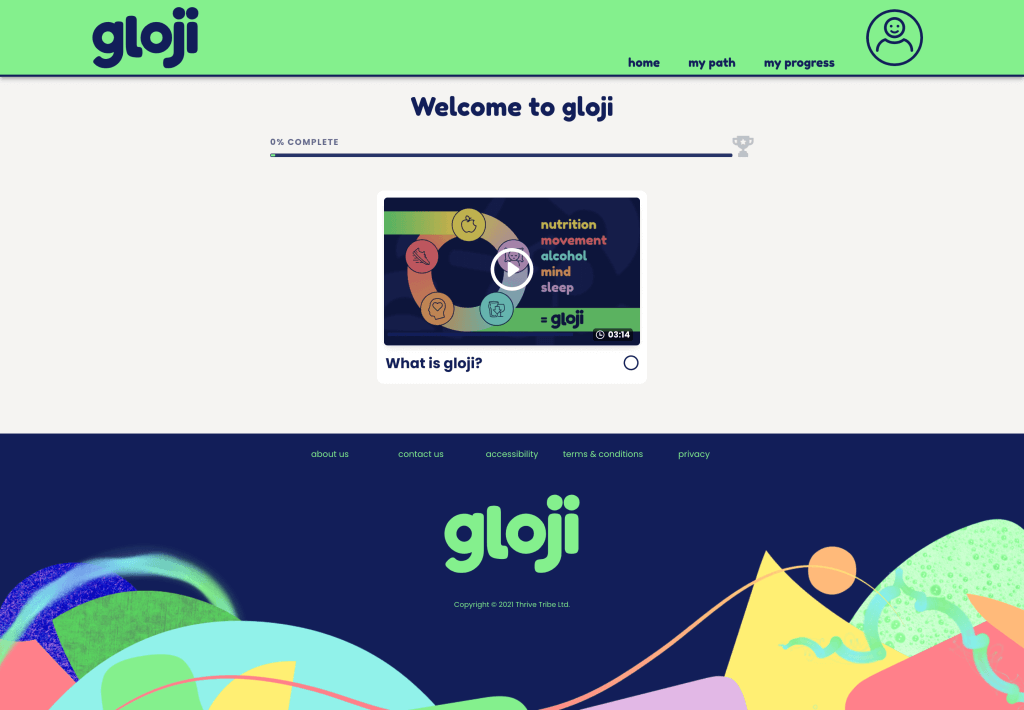
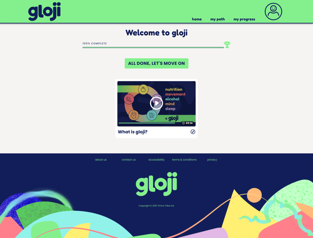
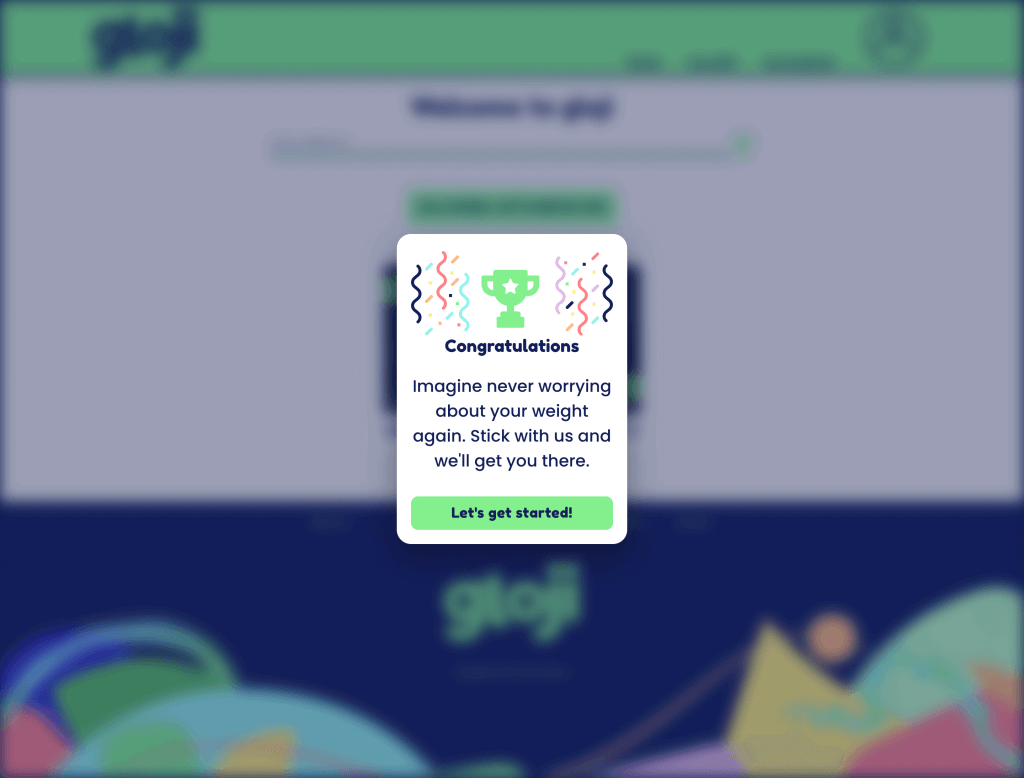
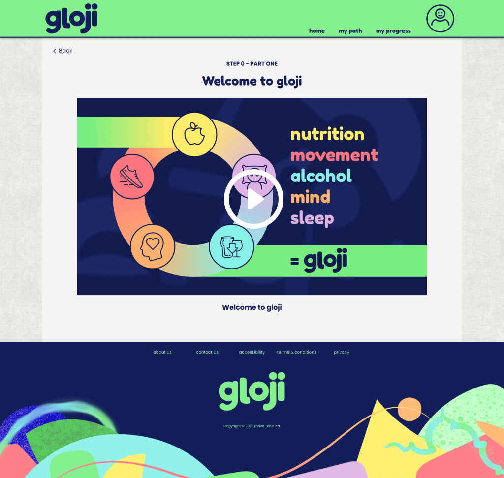
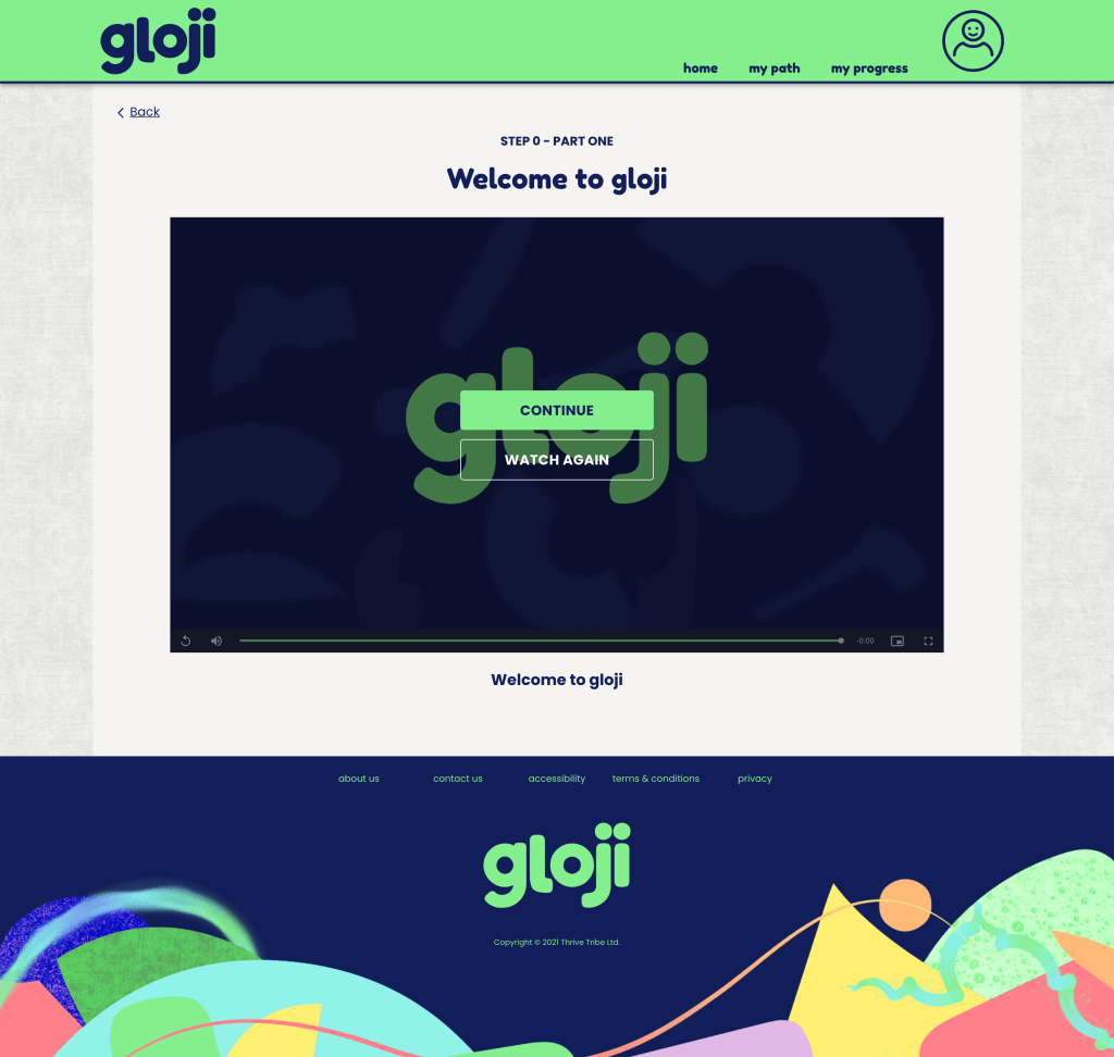
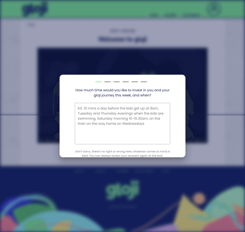
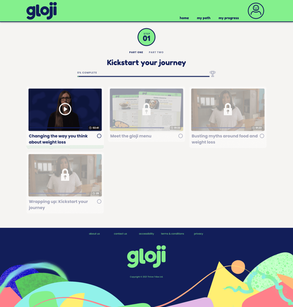
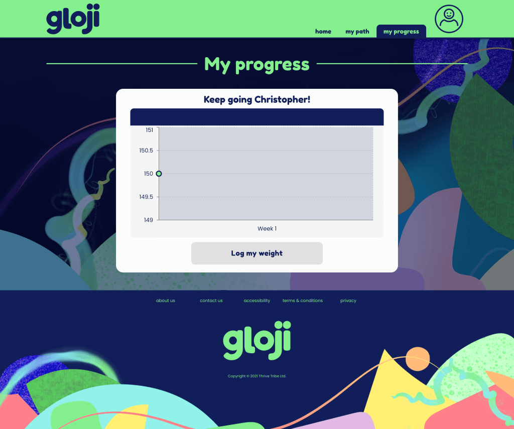
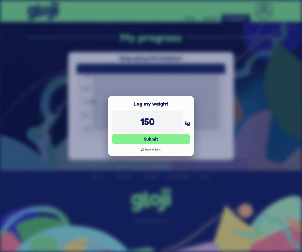
Gloji is a revolutionary weight loss programme for health and wellbeing, at the forefront of helping those with poor physical and mental health habits to make improvements in their life through accountability and understanding. When I was brought in, the team were 3 weeks into their build but had no designs of any fidelity – this is something that we quickly had to resolve with immediate requirements and wireframes, along with a UI framework to provide quick functionality that we could later come back to and apply a visual identity to. This minimised risk going forwards as well as showed value and progress to stakeholders.
As the UX lead, I worked with a team of content designers and one graphic designer to design and develop wireframes of varying fidelity. Being part of the product team meant that I could easily interpret requirements, run user testing and work with the development team to design and implement a final product that met both the user and business needs.
The objective was always to hire in house designers and developers, so to aid that transition I built a functioning style guide for the entire team to see and work with, to act as a version of the truth for functionality going forwards.
As part of the work I:
– was lead UX on the projects
– created high and low fidelity wireframes
– identified quick wins for the product and the business (using a UI framework)
– created responsive designs
– ran remote user testing
– worked closely with the product team to understand and define requirements as well as presenting designs and user testing feedback
– worked with a content design team
– created templates
– was responsible for writing job descriptions to hire designers and developers
